
Thursday, March 31, 2011
Informationisbeautiful.net
Andrea, here's another find for you. Not quite like your drug infographic, but an interesting classification of drugs.
Wednesday, March 30, 2011
Bom Chika Wah Wah
Hey there. Updated version of project two from after class. Let me know what you think of combining such a technological setting such as facebook with the hand drawn images.
Tah Dah.
Tah Dah.
The game of life-style infographic
Hey Claire,
Thought of the Life idea for your infographic when I saw this one:
http://awesome.good.is/transparency/009/trans009ondriving.html
Thought of the Life idea for your infographic when I saw this one:
http://awesome.good.is/transparency/009/trans009ondriving.html
When couples are most likely to break up
Keep this one in mind when planning your April Fool's jokes..
Some science infographics
This one is awesome because of its use of scale. It's about evolution.
This one is a good example of how to make an infographic interactive. It's about spacecrafts.
This one is also interactive. It's about the Hadron Collider.
Tuesday, March 29, 2011
Project 2

Here's the initial set up of my project two. I want it to look very realistic, so I'm using the actual site to work from. I think that this is going to end up being very successful.
Monday, March 28, 2011
A Couple of Infographics
This first one is about comic book characters. It's fun and uses very little text.
Marvel Family Trees
And this one is about college costs. I think it's really nice looking (I like the monopoly reference), and it's also kind of relevant to our lives.
College Costs Graphic
Hope everyone had a good weekend.
Marvel Family Trees
And this one is about college costs. I think it's really nice looking (I like the monopoly reference), and it's also kind of relevant to our lives.
College Costs Graphic
Hope everyone had a good weekend.
Wednesday, March 23, 2011
Infographics from Twitter :)
How Big is your Byte. Measuring data amounts as real world everyday examples. http://ow.ly/4l1Tj
The classification of fruit. http://ow.ly/4d9x7
Infographic of the Day: The Facebook Map of the World | Co.Design http://ht.ly/4l1w6
The classification of fruit. http://ow.ly/4d9x7
Infographic of the Day: The Facebook Map of the World | Co.Design http://ht.ly/4l1w6
Monday, March 21, 2011

Sunday, March 20, 2011
Radiation Infographic
Interesting infographic by XKCD comics that relates radiation dosages from natural sources, to those you might get from medical treatments or from nuclear reactors.
Radiation Infographic
Radiation Infographic
Revised infographic


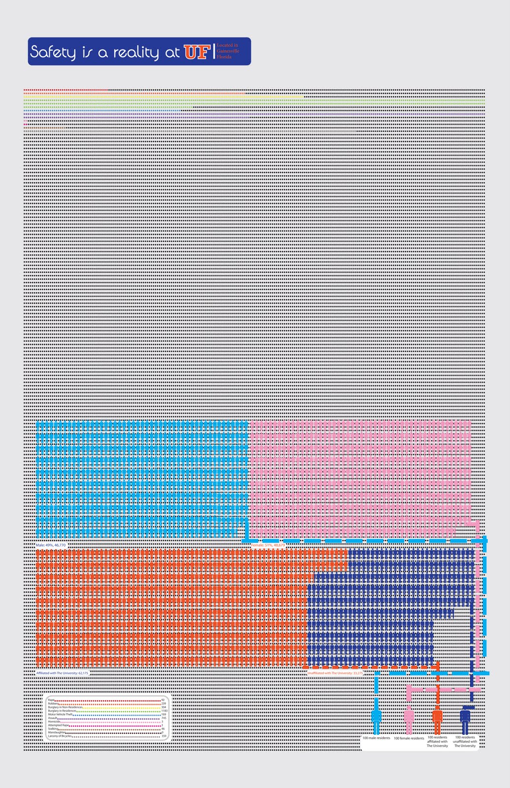
Hope everyone had a good weekend! If people wouldn't mind looking at my final infographic, that would be appreciated! I want to user-test it tomorrow. Is there too much text? Are the colors ok? Is everything clear? On the bottom right is the whole poster and then I split it up into 1st and 2nd halves on the left. Thanks!
Friday, March 18, 2011
what we pay for a gallon of...
Interesting infographic that compares the prices of paying for a gallon of different liquids.
Thursday, March 17, 2011

Wednesday, March 16, 2011
Link to Infographic analyzed in class (03.16.11)

Tallest mountain to Deepest Ocean Trench: Land/Sea
One page analysis on its use of typography, color, scale, and images by Monday, March 21st.
Some Major Changes
If you click the image, you'll be taken to the flickr with some more detailed screen shots as well.

Also, here's a google docs of the .pdf.
Also, here's a google docs of the .pdf.

Tuesday, March 15, 2011

Net Worth of Presidents and National Debt
http://www.creditsesame.com/blog/net-worth-of-american-presidents-vs-national-debt/
Monday, March 14, 2011
Japan
NY times homepage has a useful infographic of Fukushima plant using satellite images. http://nyti.ms/cjEzGm
Today's "Serious Play" Notes
· Video: Serious Play
· Tim Brown, May 2008 from Ideo
· Exercise: draw a quick sketch of the person next to you, 30 second sketch
o Findings: Audience’s embarrassment of showing ideas to peers or those considered peers
o This fear causes conservative behavior and thinking, restricts flow of ideas
o Kids have no embarrassment and readily share ideas, but adults do not and kids grow into this
· Trust makes it easier to take creative risks,
o Design interfaces and work environments made to relax people
· Symbols in work place remind people of a permissive environment, and encourage them to become playful, playfulness is important
· Creativity helps things get better and improves results
· Adults must relearn creativity and play to accomplish this
· Role playing limited or diminished throughout development
· Analogous/vicarious experiences are roleplayed prototype experiences
· Modes: divergent more playful and convergent more serious
o Movement through these two modes are important
· We need trust to play and trust to be creative
· Behaviors useful as kids: exploration, building, and role play
Dots are Back!
I figured since it was difficult for everyone to see the details, I'd upload a .pdf and share it. A few things are different, such as the colors of the map and I've begun to add the dots back in. Let me know what you think :)
Sunday, March 13, 2011
Hans Rosling's 200 Countries, 200 Years, 4 Minutes - The Joy of Stats - BBC Four
An infographic as a teaching/explanatory tool, used like a weatherman's map. Optimistic data, but very cool technology.
Video Link
Enjoy!
Video Link
Enjoy!
Thursday, March 10, 2011


Wednesday, March 9, 2011
Infographic! Project 1

I think the images are mostly done, I might have to do a little touching up. Sketches to digital images is new and fun, and time consuming :)
The text isn't finished yet, but the maps are complete, just got to add a key to differentiate between the colors. What do you all think ?
(there is a white border around the image and the text and branches do extend onto it, I realize displaying it here that it has a white bkgd, so the border is lost....)
Updated Infographic - Claire Edwins
My infographic is here. It's kind of small. If this is a problem let me know and I will try to make it bigger.
Infographic
 Here's my infographic so far. Pending on your suggestions, I think I am done with the graphics. I am still working on the text, I will be adding more information (and will be moving it around). I know it's a lot of text, but it's very difficult to explain otherwise. Any suggestions are appreciated. Thanks!
Tuesday, March 8, 2011
Project 1
Here is my infographic for project one. I still can't decide what to make my background color.
Monday, March 7, 2011
grain like rain

Here is my infographic, it's probably not that great, but i definitely put a lot of work into it... The purpose is to compare where grain comes from, and where it goes, and what countries can sustain themselves in a food crisis. I was inspired by Russia's ban on grain exports a little while ago, which caused a domino effect, since if a country needs to import large amounts of food, then if other countries stopped exporting, those countries would face a serious problem.
*Note: I noticed the textbox under india is crooked, and fixed that, but it's a lot of trouble to convert to a jpg, so I left this version up.
Saturday, March 5, 2011
Some Changes

I've updated my project since the last time I posted, so before you all comment on my last question, I wanted to give you the most up to date version.
Friday, March 4, 2011
My infographic so far!

Hey everyone,
Not sure if you can see this too clearly but this was the only way I could figure out to post it as a jpeg. What do you think of this layout? I decided vertical may be better to create more text space. Is it too much text? (I'm not done with all of it). I am trying to keep it simple with color, so I chose not to use many.
I'm going to be doing volunteering work in Mississippi during break so I will most likely not be able to check this until I get back.
Have an awesome break!!
Amanda
Thursday, March 3, 2011
SPRING BREAK :D
SPRING BREAK!!! YAAAAAY!!!!!!!!!!!!
I hope everyone has an enjoyable, relaxing break (and that we accomplish a lot on our projects).
Here's an infographic about spring break... http://www.onlineschools.org/blog/spring-break/
I hope everyone has an enjoyable, relaxing break (and that we accomplish a lot on our projects).
Here's an infographic about spring break... http://www.onlineschools.org/blog/spring-break/
Wednesday, March 2, 2011
Infographic Project
I was wondering what you guys thought about me placing the dots as the background and overlaying the titles and information on top. Let me know what you think please :)
Tuesday, March 1, 2011
2011 Adobe Design Achievement Awards
If anyone is interested in applying for 2011 Adobe Design Achievement Awards, check out the site with some more info.
The Adobe® Design Achievement Awards celebrate student and faculty achievement reflecting the powerful convergence of technology and the creative arts. The competition - which showcases individual and group projects created with industry-leading Adobe creative software - honors the most talented and promising student graphic designers, photographers, illustrators, animators, digital filmmakers, developers and computer artists from the world's top institutions of higher education.
Subscribe to:
Comments (Atom)